12.20.2006

the importance of play

I also do watercolor. In that medium, I play with small pieces every day, keeping a feel for the problematic water/paint ratio, trying new things, now adding in goache and acrylics. But for some reason, I've avoided doing that practice, that play in fiber.

Can't quite figure out why. Somthing about fiber being more important (to me), or the cost of materials, or some undiscovered reason. I tend to think that every piece of fiber art I make is important. And it shouldn't be. It should be that some are, but some are just learning experiences that will never leave the house, even as jpg's on the web.

I should practice what I preach to my classes--to follow the Doritos principle: Use it, they'll make more.

In that vein, I've started playing with fiber. I've been trying to make needle felted hedgeapples; so far the examples are interesting looking (translation: they have a nice personality), but not very evocative of hedge apples. I have a big piece involving them I'm designing in my head, but that's not playing around...

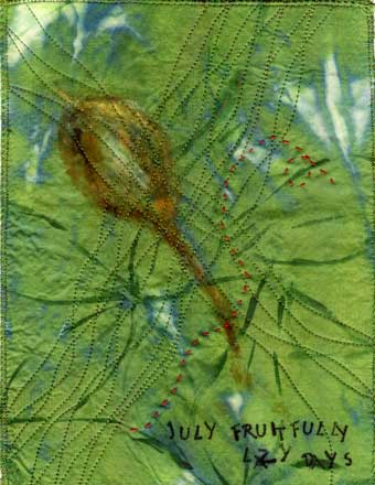
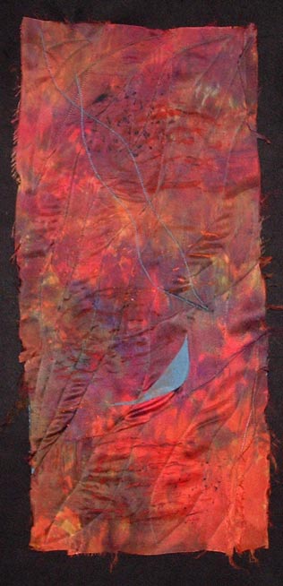
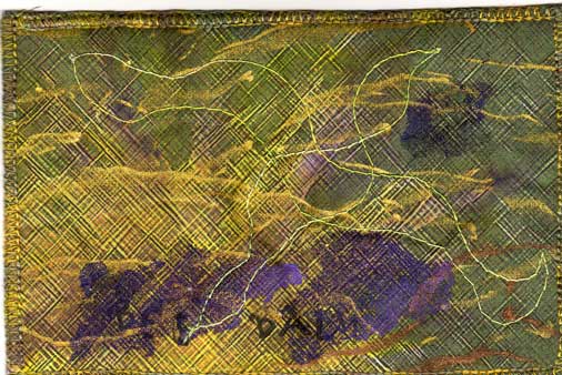
Then yesterday I dug in my fun box. It is filled with snips and pieces (Ann, you don't get them all) of things that didn't work, things that needed trimming, pieces from playdates where we tried new processes. I took a piece of polyester that had been disperse transfer dyed, trimmed it down. Then I fused some curves of hand dyed silk on. Next came lots of close quilting, using a piece of felted wool sweater as a background and as a batting. Here's the result:

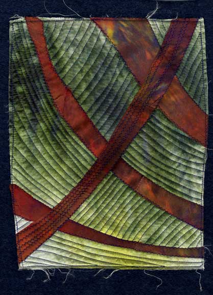
I got lucky. This one came out pretty nice. It is a little greener in person than it's showing up on my monitor. Anyway, this is a keeper. But if they aren't, back into the box they go for another time. Some of the postcards I made for Fiberart for a Cure were the result of these bits and pieces. So far, I don't think any of them have led to bigger pieces, but I'm sure that things I have learned that no one else can see have made their way into other work.

The moral of this story is take time to play. Don't worry about the outcome.

12.02.2006

December and the end of a series

I blame myself. I had been thinking that I never had portrayed this little tree in snow, and on the first day of December we get 10 inches of the stuff. So instead of digging out, I made this month's entry.

During much of the year, the buckeye lives in the shadow of some large Norway spruces. In those late fall and winter months, it receives no direct sunshine. So when examining the tree from all angles visible inside the house, what struck me most about it was the shadows of the spruces on the snow around the bare limbs sticking out--and the fact that I could already see the buds for next year from a distance.


For the first time in this series, the above scan isn't quite right color wise. There are more subtle variations in it, and the wrinkles that show up aren't that visible in real life. The background is silk, the tree is hand dyed cotton. The tree was free hand cut and fused to the silk.

The quilting borders on being a little sweet. It was meant to be snowflakes drifting down, but they're more cute than anything.

The words say "December Beckons Us Onward." That's because this series is leading me onward. Looking back over the year, some pieces are better than others, some are more abstract, some border on being too canned, some approach being art. I view them as a series of sketches, a remembrance of the year 2006.

Next year's theme is going to be something more abstract. I expect the season of the year, the weather, events, to influence the pieces, but I also hope that previous ones inform later ones, that the series improves with the year. I'm not sure this year did. But maybe I can't see the forest for the buckeye trees.


11.25.2006

website updated

I spent part of this holiday week updating my website. Mostly tweaking it, but I added a page for my critique group, the River Road Fiber Artists. And some pictures of me on the 'about me' page. And changed the background to a piece of composted fabric rather than a solid color. It takes a little longer to load now, but maybe I'm the next to the last person on the planet still on dialup....

"They" claim that you need to change your website frequently so you stay high in the rankings on search engines. But since I'm getting ready for a couple of shows, I haven't gotten new work done lately. So does tweaking count? I mean in the eyes of the search engines, probably, but am I just now using the web site as another way to waste time?

I have started a bunch of things this fall. It's just that none of them are done. I'm having trouble finding the end point...just as I am in the website. Maybe that is part of being an artist, never being quite satisfied with what's been done so far. I know that my biggest problem in watercolor paintings is stopping when I should--at least fiber pieces the damage of going to far is usually reversible...

Here's my favorite of the pictures I added--me ziplining over the canopy of the rain forest in Costa Rica...it is, I think, symbolic of the risks I'm taking making art--leaping out into the great unknown. Although I don't think failing in art would kill me...


11.07.2006

November buckeye

This November has started out dreary here. It has been an unusually cloudy fall this year. So maybe that explains the darkness of this piece. Or maybe it's because all the leaves are long gone from the tree, and I've plucked off all the seed pods because of my fascination with their shape and texture, and there is little to distinguish the tree from its surrounding.
But part of it is because of a watercolor workshop I took last week from Carol Carter. Especially the glowing backlighting.


I started with Setacolor paint on dupioni silk, after lightly sketching in the tree shape. The yellow glow was added at this point, as well as some sparkly pearlized paint. When that had dried and was heat set, I used fabric inks to do the tree--the Setacolor seems to help stop the flow of it, so I was able to get fairly sharp lines. I shaded the tree with some heat set pastels.

The stitching was done in spirals--the leaves swirling around in the autumn wind, the flocks of starlings toing and froing in the sky. The words say 'November Winds By.'

This year is almost done, and I'm already thinking about what to do next year. I like doing small series such as this, and the monthly schedule doesn't put too much pressure on. Next year's will maybe start with a design that evolves month by month. Don't know for sure yet.

But meantime, the buckeye approaches full circle--leaves are gone, the shape reasserts itself. It has gotten taller, produced a bunch of potential offspring, survived. And I have documented this, which makes me smile.

10.10.2006

October buckeye

Autumn is a time of big changes around here, although this year that's been hard to see sometimes. We've had record highs, chilly nights, clear blue skies, dreary grey days. Ok, a typical midwest fall.

The buckeye tree has compound leaves (technically that means that what you might perceive as leaves are actually leaflets on a leaf stalk; you can tell by looking for the bud for next year's leaf) As with most compound leaves around here, the leaflets fall off, leaving the bare stalks on the tree for a few days. In the case of a Kentucky coffee tree near the buckeye, the stalks are red and really stand out. The buckeye currently has yellow leaf stalks, no leaflets in sight unless you look on the ground, and a few pieces of open buckeye pods.

So this piece began with the inspiration of the clear deep blue skies and the leaf stalks and the curly, fuzzy seed pods. The basic background is a piece of old damask tablecloth that had been dyed with osage orange to an ochre color. Using masking tape stencils to mask out the leaf stalks, I painted the sky with Setacolor paints.

After that dried, I removed the masks and painted the stalks to give them some depth. Three pieces of a curled up pod were scanned and printed onto raw silk. I cut these out and fused them to the background. The quilting lines remind me of the floating and soaring of leaves in the autumn wind. The words 'October Breezes By' were stamped on the lower edge.


When I started this series in January, I was obsessed with the shape of the tree, and thought it would dominate this series. But the last few months I have been playing with the seed pods. I guess it goes to show that is one of the benefits of doing a series is that you don't know where it will take you. The series takes over to some degree. Of course, the next two months, leafless months, may cause the tree form to come back to my art. Wait and see.

10.04.2006

defining fiber

I find lately that my work has ceased being 'art quilts'. For one thing, it seldom has three layers, unless you count the layer of applique on top of the top layer...for another, it's starting to include fibers that aren't really fabric.

For instance, I'm working (although it feels like playing) on a piece that starts on a failed monotype on paper. Failed in the sense that it was a messy pull off the plate, and it just didn't work on its own. To it I've already added some silk and some metal foiling. After I had stitched across the paper--wonder if it dulls needles like it dulls scissors. Probably. But it's become a little piece of art.

My work does better in art shows than in quilt shows, maybe because I've strayed too far from quilt rules--I actually like uneven, big stitches. But that's ok with me I think.

I'm busy working on getting ready for a big solo show in February (in Jacksonville, Illinois, more details later), and I find the freedom of being able to frame or not frame a piece, to include an oddball material like window screening or twigs is a good thing.

So my definition of 'fiber art' is expanding. A picture of the first piece is below....percentage wise, it's around 10% fabric. But paper is fiber. So it's somewhere between fiber art and mixed media and the only time I have to define it is if I enter it in a show with categories.


9.10.2006

september buckeye

September has landed in Illinois with a dry, cool breeze and a bright blue sky. Of course, part of that is because we're in a drought. But leaves are starting to turn, and the buckeye pods are ripening. The leaves are starting to turn yellow and dry up.

And in looking back at the previous months, I thought it was time to capture the clusters of buckeyes. The pods are kind of elongated, almost pointy on the ends. The buckeyes inside are fairly round, but the pods aren't. One morning this week, they were capturing the sun on their fuzzy surface, and I saw what I wanted to depict.


I began with a piece of tablecloth linen that I had dyed using osage orange and some nails. Using Shiva paintsticks, I first drew on the shapes of the pods. Then I used a small stencil brush to smooth out the color and to add highlights and lowlights of other colors. I have found that unless I'm using stencils, I like drawing directly on the fabric first with the paintsticks. Probably it's my impatience, but just using stencil brushes seems to take too long to start seeing the look I want.

I stared at the impressionistic cluster of pods for a while. I thought I was going to stitch around them and add hints of leaves using thread only slightly different in color than the background. But when it came time to do it, there was black thread on my machine and I was compelled to try it out first. Liking what I saw, I continued (the piece was backed with a piece of felt by this point) doing the whole thing in black. I think the result looks like a pen and ink sketch.

The words are 'September Ripens', a reference to the setting in of fall. By October I fear all the leaves will be off this little tree, and the cold winds of winter will be heard faintly in the distance. The year has sped by, as usual, but the little line of these pieces on my design wall marks the time passage.

8.17.2006

disperse dyes

I've gotten some comments about disperse dyes. I have to admit that when I first tried them, it was part of my critique group's 'play days', and just seemed like yet another fiber toy that mostly distracted me rather than helped my art.

Part of that was, I now see, a fear of polyester. Coming from the traditional side of quilting, I had been indoctrinated with the mantra of 'natural fibers only'. In fact, 100% cotton only. A couple of years ago I branched out into silk, and haven't looked back. After all, the things I make are probably never going to be washed, aren't used to comfort sick children, why worry about what they're made of so much?

So I'm embracing other fibers. Even polyester, which does have its own advantages--you can seal the edges, the hand can be nice, some have a good sheen. And I like the look of disperse dyes.


This piece is 8"x6". The disperse dyes were painted onto a sheet of regular copy paper. I was going for a sunset scene, something to turn into a landscape. This was the first print (they do get a little lighter with each successive print), on a shiny white polyester about medium weight.
I had still more blue slash pieces (see my website if you don't know about the blue slash series) with steam-a-seam2 on them, and the color was right, so they found their way onto this piece. I backed it with a piece of felt and quilted both the diagonal stream lines on it (the piece is named 'Downstream'), and horizontal lines for variation.

But what I like most about disperse dyes is their ability to be subtle. I don't know of another way to achieve this with paint. Maybe you could do it with printing from a computer image. But each image is slightly different, and you can repeat if you need to. I'm working on a couple of other pieces where I have printed more than once on the fabric with the same sheet. I've also overprinted with different sheets.

My only complaint with disperse dyes is that the color on the paper isn't necessarily the color you see when it prints, particularly with the greens. But that can lead to happy accidents. Or a piece to save for another day.

They do not change the hand of the fabric any. I got mine from ProChem; I mixed up the powders several months ago and am still using them. They are getting a little weaker and may be almost ready to throw out. But the papers are good until you use them. And after all the prints have been made off them, they still could be used for collages or mixed media work.

So give them a try. ProChem has instructions on their site, it's the transfer printing method I think.

8.05.2006

the buckeye in August

The buckeye is one of the first trees in our yard to show signs of fall. The weather has been hot and dry lately, but it still is usual for the green to be disappearing from the buckeye by now--some leaves are completely yellow, others are starting to turn. The buckeyes continue to grow. By the time of the September piece, I expect the leaves to be falling off the tree.

So this month I wanted to celebrate the leaves yet again, while they're still in their shiny glory (the fall leaves are usually not very flashy on this tree). The background fabric this time is a polyester satin. I haven't usually used non-natural fibers, but then I discovered the process of transfers of disperse dyes. You paint the dyes onto sheets of paper (regular printer paper), let it dry. Then you can iron the design onto polyester fabric (it doesn't work on cotton or silk unless they have been painted first). The effect is more etherial than direct painting would be, and you can make multiple identical (although maybe fainter) prints--as I did on this piece, the tree shape was repeated.


It can be a little disconcerting to use the dyes, as the color they appear on the paper is not the color they print always. By the way, I got the dyes from ProChem.

The leaf shapes are cut from the same silk as the background fabric of the July block--dyed and painted. I fused them on, then quilted parallel lines diagonally over the surface. The words this month say 'August falls leaf by leaf.'

Autumn really starts quite early here, if you define autumn as involving seed ripening and plants dying back--the early spring bloomers are already gone. It's like a reminder of our own life cycle--the end is around the corner, we just don't know how far the corner is. But you have to stop and celebrate the moment, too. The moment when some leaves are still green, the fruit is still immature, the dry flies are rubbing their wings every night.

7.19.2006

travelling and inspirations

I'm on the road with my husband. A good excuse to play, or as some might call it, goof off. But I've been thinking a lot about my work, what to try next, what needs to be finished before my next art fair or show; but mostly about where I want to go with my art.

Sometimes I think I'm an artist in search of a medium. I'm most successful in fiber, but I keep richocheting to other media--watercolor, oils, paper collages, photography. Those attempts remain in the background, but I think they're influencing the fiber stuff.

So I present to you a photograph I played with in Photoshop Elements yesterday (ah, the joy of finally having a laptop to travel with...)


It began life as a picture of yellow crocuses against brown leaves. I can't wait to print it on silk and add some stitching to it. Or to try painting a big piece of fabric using this as a reference. Or making some felt with this as a starting point. Something tactile. When I get home.

7.06.2006

July and the buckeye

June was kind of a washout, art-wise. I spent much of the month getting ready to travel, travelling, and recovering from travel. I'm sure the experience will show up in future art, but it felt good to get back into the studio and just do the work today.

And to have a series to get me going. July in the midwest is full of lazy afternoons, spent in my hammock reading or bird watching, watching the summer progress in the garden. The buckeye leaves are still a lush green (buckeyes lose their leaves early), and the fruit are slowly swelling inside of velvety golden brown pods.


The background is hand dyed silk. Using Luminaire metallic paint, I loosely drew in the five leaflet leaves of the buckeye, overlapping as they do in reality. Then I decided I like the back side better, where there was more of the olive green showing and less of the metallic part. I fused the silk to a piece of felt to stabilize it, and then drew a seed pod on with Shiva paintsticks. Instead of waiting 24 hours as usual for the paintstick to dry, I went ahead and pressed it with a hot iron--and the strokes flowed together. Using a varigated green thread, I stitched curving lines across in two directions, entwining the lines where possible.

The words were stamped on; they say 'July fruitfully lazy days'. Kind of a summation about how I feel about the month.

The piece didn't feel quite done at this point. I had an elementary art teacher who claimed that all good pictures have a spot of red in the center. I don't believe that--now--although that probably accounts for the long vacation I took from making art, from about 10 to age 35. But I do like the excitement caused by opposing colors. Analagous schemes lure me, but those opposites just pop. So I took a piece of red pearle cotton and stitched a lazy running stitch across the top. Now it seems done.

This series continues to draw me in, give me a place to work when no ideas are coming. I am casting about for ideas for the next series, and wondering about the wisdom of having two series going at the same time--I do have an art fair and a solo show to get ready for. But now that I'm back in the studio, I'll stay there. Until the next distraction, the next hammock beckons.

6.06.2006

halfway point of the year of the buckeye

It's June, and the 6th piece of my 'year of the buckeye' series is done. Even as summer begins with a hot vengence, fall has also begun. Baby buckeyes are forming all over the tree, oblong globules of a umber-ochre color. And the leaves are out in full, going every which way, crossing over each other.

At the same time, I've been working on a small piece for my crit group based on a challenge called 'bits and pieces.' That piece is layer upon layer, encrusted, embellished, rich, heavy, over the top with details. Along with other exposures in my life lately (an abstract landscape oil painter, my garden), I wanted this piece to be at the other end of the spectrum--just using as little as possible to get my point across. I got close, but not close enough.

I started with polished cotton, which I painted with Setacolor paints. I placed an actual buckeye leaf on it, where it was are the light areas. Then I stitched lines inspired by the veins on a leaflet. Dashes cut out of scraps and pod shapes cut from hand dyed raw silk were fused on.

While the piece is simpler, calmer than my bits and pieces one, it still hasn't gotten down to the essence of what I was going for. But maybe that was because I didn't distill the thought into minimal words? Does the thought give birth to the art? Does thinking inspire art making? Is the scientist in me being too quiet or too noisy? How do I get to that place that some artists achieve, the place where one line connotes a world?

5.18.2006

web site

I now have a web site---www.bjparady.com. I haven't figured out how to put a link on this blog yet (any body reading know how?), but wanted to share the site with you.

Learning how to write html and actually doing all the detailed writing has taken all my brain cells for the past couple of weeks. I'm glad it's behind me, at least the first iteration of the site. Maybe now I can get back to actually making art...

5.13.2006

May buckeye

May is the glorious month for the red buckeye in our yard. It is in full bloom, spectacular colors that pull off the red/green thing without looking the least bit Christmas-y. There are blooms on the end of every branch, big panicles of deep red tubular flowers. At the same time, the five lobed leaves have gotten almost full size, draping the branches and hiding the irregular shape of the tree.

At the same time the hummingbirds have returned, and the red buckeye is perfectly tailored to attract them. I frequently see one feeding on one of the flowers--always too far away and too skittish to photograph, of course.

This piece started with a close up of one of the flower clusters. I fiddled with it in photoshop to abstract it, but capture the essence of looking at it--the red/green vibrations, the touches of other colors. The ripple effect proved best, maybe hinting at the blossom from the bird's point of view as he zeroes in on his target. The touch of yellow on the rim serves as a good highlight.

The bird is stenciled (hand cut stencil out of freezer paper) using shiva paintsticks, including some irridescent ones. The stitching mimics the feel of the long flower stalks, the freeness with which they sway in the May breezes.

Both the background and the printed piece are silk, which adds to the luster of the piece. Side by side with previous pieces, this one is noticably cheerier, brighter, greener. But so is the yard--gone are the neutrals of winter and early spring, the dominant color is now green, lush green, life reestablishing itself. May, one of the best months in the midwest.

5.03.2006

the year of the robin

Robins have been in my life in a big way this year...lots of them around all winter, encounters with them in the snow, and now a nest with four little ones on my patio. It seems appropriate to mark 2006 (even though we are only 1/3 of the way through it) as the Year of the Robin. And to commemorate it with art.

The problem, as usual, is how to achieve that. The idea has been rolling around in my brain for weeks, encounters lodging themselves in my memory. My work in general has been getting more abstract lately, but most of the visions I see for this piece take a step backwards from that.


This quick sketch was done with shiva paintsticks on a suede-like polyester fabric. I drew directly on the fabric, and then softened it with mineral spirits (the only solvent I had in the house that would work). Then I stitched some on it with varigated thread. It's a start.

I keep thinking of some pieces of western art I saw on Antiques Roadshow. I think they were done by a native American artist, and were kind of petroglyph-like. Just outlines mostly, with some color filled in here and there. A kind of narrative moving across the piece.

So I could start in a corner of a piece of fabric and add things as they happen this year--but I'm torn between just drawing them with paintsticks or ink, and stitching them...

Which brings up yet another dilemna working away in my brain. Lately I've just been backing my pieces with acrylic felt, so they are only two layers. Less finishing to deal with, flatter, less heavy. So they are no longer really 'quilts'. Do I care? Not much, but it makes the piece harder to define on a show submission...maybe I just don't have enough real life problems to worry about, huh?

The year of the robin will probably end up being a personal enough piece that it will never be for sale anyway. So what do I have to lose, right?

4.10.2006

Buckeye in April

This has been a hard month to capture--it seems as if the buckeye is changing hourly. One morning last week I took pictures of the ready to burst open buds, by the afternoon they were changed...so I had trouble deciding which moment to choose.
I have a picture that I printed out on organdy, but it was too realistic even as I had abstracted it in photoshop. I'll make something of it, but not the April buckeye piece.
Instead I went more expressionistic--bud shaped fused pieces, freeform stitching, strokes of shiva, all reinforcing the idea of the buds busting out. The essence of spring.
The actual piece is a little less bright than this scan...I'm having trouble with the shininess of the silk background.

3.30.2006

inspiration where you find it

Yesterday I had the chance to watch a great documentary, called 'Rivers and Tides'. It's about a Scottish sculptor named Andy Goldsworthy and the creativity exercises he does. He goes outside and makes art with natural objects, sometimes deliberately placing them where they will be destroyed when the tide comes in, or the wind comes up. He makes beautiful, if temporary pieces this way. Rent the movie and watch it.

Today is one of the first warm spring days here in Illinois, so I took a walk and tried it. This piece was made by gathering oak bark and twigs in a small area, and laying them out ala a log cabin. I made three pieces in all, the biggest around 12" square. It's a very freeing exercise to stimulate creativity--because I knew it probably wouldn't be there tomorrow, and because all the supplies were free, I just played. It would be very easy to enter a meditative state doing this. Try it.

The other thing I have been doing on my walks is taking pictures of the cold patches on the asphalt--for some reason I keep seeing one of my personal symbols, the kayak, on the road...haven't figured out what to do with them, but they're cool I think.

3.24.2006

Dance of the Blue Slash

Sometimes I intentionally work in series, exploring a certain idea, exploiting the same inspiration. Sometimes I find a series when I'm two or three pieces into it, when I lay the pieces side by side and realize the connection. Sometimes I've forced things into a series for expediency, as in the planning for my website (soon to be coming to a cyberspace near you). And sometimes the series just explode into my studio, linking the pieces together with some kind of synergy springing from my artistic brain, bypassing my scientific brain.

The Dance of the Blue Slash series is a prime example of the last kind. It began on the kokopelli quilt I discussed before, where the unfinished piece needed some bright blue pieces. I dyed a piece of silk the right color, and fused part of it. I cut off the pieces I needed, and they worked. But I had cut more than I needed, and so there were extras laying on the chest right beside my design wall.

So the March buckeye piece came along, and needed a border. The blue slashes jumped over and formed the border.

Next came an abstract view of the hills around me in their winter dullness...it needed the blue, too, five tiny pieces on the surface, floating in the space between the hills.

Fourthly, there was a piece of silk I had painted abstractly from a memory of the wooded riverbank in late fall--greys, rusts, some blues and a touch of yellow here and there. Although I had added some texture to the piece by pleating it, the piece was unfinished. Until the blue slashes said, hey, make us long and skinny and we'll fit between the pleats and spark the piece up. They do. I currently am trying to fight the fact that this piece would like to be in a windsock shape with a light inside of it--being silk, it glows...the mechanics of that are still giving me pause.

And fifthly, there was a small practice piece that has been kicking around for months. It is a prime example of more is more, having every technique I've been using lately on it almost. But it wasn't quite right, not finished. The small blue slashes danced on to it, and found a home. The piece is now quilted and ready to mat. The edges are uneven and ravelling, but I like it now.

3.10.2006

March Buckeye

Spring is finally coming to the midwest, slowly but surely. The temperatures are milder, the grass is greening up, migratory birds have returned.
I decided that this month I wanted to use an actual photo of the buckeye as a basis for the piece. When I went outside to shoot it, I discovered the swelling buds were calling my camera. This closeup has been cropped and manipulated in Photoshop Elements, and printed on silk. I then fused it to a neutral piece that was slightly larger.
These scraps of sky blue were left over from the moon dance piece I talked about last time, and they make a good border--kind of like the sky peeking out with that intense blue we only get at this latitude in spring and fall.
I've been taking a course at Quilt University in using new, nontraditonal stuff. Through that I got entrapped the last few days with transparent ribbon--I'm trying to put it on everything. I used it as a binding on the knots piece (a dark blue that finishes the piece but lets the varigation in the fabric underneath show through), as a border on another piece. And now as strips across this piece. And as part of the beads.


Anyone who knows my art work well would tell you that I am fascinated by the effects of fire and heat on things. I frequently burn the edges of silk, and now I have added melted ribbon to the mix. The strips were first disperse dyed, then sewn in place. Then I melted them with a heat gun hovering over them. I then quilted the background, I wish I had done that before the strips were added, but these pieces are the equivalent of sketches--I learn from the doing, I don't redo them unless they really don't come out (hence the cutup earlier version of this picture currently residing in my stash of bits and pieces).
Wanting to add a dimensional touch, this morning I got the idea of trying to make rolled beads out of the ribbon. I rolled a short length around a wooden skewer, and added some small pieces of another sheer organdy on top. After pinning the ends in place, I went at it with the heat gun. It fused the layers together, and added texture at the same time. The base ribbon has a yellow edge on it, so when I was done the beads echoed the shape of buds on the buckeye.

March is a changeable time in the midwest, 60 one day, 30 the next. Grey one day, clear and windy the next. But it is a time when hope returns, when life returns. By next month the buckeye will probably be in full bloom, I'll be mowing, be outside without a coat. That will be good.

2.22.2006

symbols as cliche

I'm working on a big piece, well big for me. It's around 3 foot by 4 foot. The working title is 'Dancing in the Light of the Moon', subject to change. This piece has done a lot of its own decision making, veering off into directions I never intended. For instance, the background fabrics started out as an attempt to replicate the rolling hills and fields around the river here. That's a little hard to see now as it wanted to be dyed fairly dark.

Anyway, it's time to quilt it. I want to convey more of the dance feeling, and my first thoughts were of adding a Kokopelli. I can see him playing the flute in the bottom left corner, some little moonlight sonata, enjoying the moment.

But then I became obcessed with the thought that Kokopelli is too overdone as a symbol, has become a cliche, some kind of southwest joke figure. Do we have the right to claim anything as a symbol in our artistic lives, or are we limited to things that come from our personal past, our personal culture? Is living in the same country that Kokopelli's inventors lived enough? Does using him step over the line of trendiness, becoming trite in the process?

And if I invent my own symbol, what does it convey if no one knows the background of that symbol? I use the kayak as a symbol in a lot of my work, but it's never a very realistic kayak, and only occasionally does it become instantly identifiable as a kayak. And does the viewer think the same thing as I do when they think 'kayak'? I think of floating down the river, leaning back and staring at a rising full moon, my hand trailing in the water. It's a peaceful symbol to me. But if someone else is a whitewater kayaker, I can see that the symbol would be entirely different.

Maybe I just overthink these things. Maybe I should get back to the mind space where the quilt would tell me what to do. Maybe this is part of, a continuation of, the doritos principle--do it, I can make another one...

2.15.2006

the abstraction continues

My fiber pieces continue to evolve. I now find it nearly impossible to do realism in either fiber or my other medium, watercolor. I just don't see the point of doing something that could be duplicated, or improved, by capturing with a camera. And they become less refined--it's more about the texture than the properness.

Take this piece for an example. I was experimenting with putting different types of silk together, and then dyeing them so that the color was independent of the sheen. For some reason, I liked it with the seams showing when it was done--something that wouldn't have occurred to me a couple of years ago. Silk is a bugger to deal with, and the quilting of it (carelessly I admit) left some puckers here and there--but I like them. The raw edges are fraying and exciting.

But the orange needed something. I first added the curved blue piece, but that wasn't quite enough. Up close you can see that I kind of replicated the shape, although enlarged and more freeform, in blue stitching above the actual blue piece of silk. Overall, the piece began to come together.

One of my mentors in art told me that art should look good from three distances--something like 20 feet, 3 feet, and 1 foot. For the 1 foot part of this, before quilting, I used the Shiva paintsticks again, rubbed over the same rubber stamp I talked about in an earlier post. The marks are subtle, but they add to the surface interest.

Now about the abstraction. So far I haven't mentioned the name of this piece, because it will reveal part of what I was thinking about--it's called 'blue bird'. Before that, has you recognized the swatch of blue as a bird shape? Does the name influence your view of the piece? I can't separate the two when looking at it, but then I created it so I find it hard to be totally objective.

And that lack of objectivity is part of my view of abstraction--I can't separate my inspiration from the piece, no matter if the inspiration is foremost in my brain as I begin a piece, or if it only reveals itself as the piece progresses. Does that matter? Probably not. But the process of coming from realism to abstraction has made me look at other abstract art with a different eye--the education of doing rather than just looking.

2.03.2006

February buckeye

Once again, I beat the month to the punch and started on my Feb. buckeye rendition in January. Lately I've been noticing that from a certain angle, the tree looks like a checkmark. This particular tree has not had an easy life, we've had to prune off some dead branches, and the result is a little lopsided. It will grow out of it, they always do. But I wanted to capture that simplistic single stroke that represents the way that tree looks at this time.


Ok, it's a checkmark with a stem. I picked out a piece of hand-dyed silk for some color in my life (it's been rather grey around here) and the texture in it. I decided to keep things simple and do the tree with a brush and Tsukineko ink. I started out with brown, and while it was still wet added some yellow to shade it a little. I went back in some places with more brown. Left to dry, some of the yellow blossomed out of the left hand branch--which kind of resembles how plants are trying to force the season with the warm days we've had recently.

I added some words (February The Hope Springs Forth if you can't quite read them) and some yellow rays of sunlight, and finished off the edges. It's probably done, it's just a journal piece, only 8x10 inches, and it says everything I want it to say.

I've been thinking a lot lately about the whole abstract/realism thing. I'm kind of put off by photorealism at the moment--why not just take a photograph? And I'm sure I don't quite understand the official definition and meaning of abstract art. But for me, what I'm doing is taking an inspiration from my microcosm, and capturing the essence of that in fiber by whatever means works. The question is, does the viewer understand that process without a long caption, and does that even matter? What my art is to me may or may not be what it is to the viewer. And I'm pretty sure I'm all right with that. While I make my art to sell, I also make it for me.

1.30.2006

silken knots

Coming from a traditional quilt background, when I first started making art quilts, I was firmly stuck in the 100% cotton rut. It had to be all natural or nothing.

Then I saw some pieces by Annie Helmericks-Louder, large wall hangings made of silk. Knocked my socks off--the sheen, the colors, the texture. So I started playing with silk. Made some pieces that were all silk, some that were various types of silk combined (raw, crepe).

I've been playing with some hand dyed pieces of cotton, ones that were put in more than one dye bath so there's a lot going on in them. I took this one piece and put some narrow tucks across it to increase the texture. For some reason, I had a scrap of green silk laying on my work table. I picked it up, tied some knots in it, and one thing led to another and led to this piece:


I'm not sure the difference in sheen shows up in the picture, but in person it's very striking. And the strips of knotted silk pop off the surface here and there. I couched down the strips, even the ones that are woven in an out of the others. The piece is currently backed with a piece of felt and the edges are raw, I may finish off the edges somehow...and I haven't decided whether it will be framed or freehanging...

1.12.2006

printing my own fabric

I have a closet full of commercial fabric. I don't use it very oftern. First I became enchanted by hand dyeing and discharging, and then I started printing photos on fabric.

I've been an amateur photographer for a long time. But there wasn't much to do with the pictures except admire them privately. Most weren't good enough to show as art. But then I got Photoshop Elements, and the fun began.

This series is a good example of what I've done. They are all taken from the same photo, a closeup of decaying magnolia blossoms. I lightened the color, added some artistic effects, and printed multiple copies.

This first one was printed on cotton organdy.The copies were rotated and then the one in the middle is applied so that it sticks out some.

The next was the result of printing out like 20 pieces about 1x1 inches apiece. The result harks back to traditional quilt settings. The background is raw silk.

This last one is the rescued result of trying to print too big--the picture pixelated, and the overall picture looked crummy. But cut into pieces, the result was better. I added painted webbing in the shape of a flower.


I use an Epson CX6400 with durabright pigment inks. To feed the fabric through the printer, I adhere it to full sheet adhesive labels (I can't get freezer paper to work for me, these are reusable if you're careful about taking the fabric off). As a result of only being able to print on 8.5x11 fabric, my work has gotten smaller. But I frame these pieces, and people say they like them.

1.07.2006

playing around

I've been playing around with scraps and bits and pieces, making postcards to donate to Virginia Spiegel's fiberart for a cause project (www.virginiaspiegel.com). It's an excellent cause (all proceeds go to the American Cancer Society) and also gives one the freedom to try new things.
Anyway, I had a page I had printed out of a flower picture I had manipulated in Photoshop Elements. The flower is a native prairie plant, Monarda, also known as bee balm. On my monitor, the manipulations had looked great. But it printed out way to dark. It hung on my design wall for weeks. When I was getting ready to play, I decided to sacrifice it for the cause.

Both of these pieces came from that original 8x10 print. I had heard about using Shiva paintsticks to do rubbings, so I got out this stamp I had carved.


The original stamp design was inspired by my friend's pond. In the summer time, it gets covered with duckweed. He has a paddlewheel boat, and one day some kids were paddling it around in circles. Their wake caused these swirls and ripples in the duckweed. I took the picture and transferred it to the rubber, then carved it out. It's a nice random but organic pattern.
I stretched the monarda picture over the block and rubbed on it with two colors of irridescent Shiva paintsticks--gold and copper. By varying the pressure, I was able to vary the pattern.
Next I cut them close to size. I wasn't quite satisfied, they were a little blah. I got out some fabric paints, wet them down to blur the edges, and started adding color. The top one got mostly black, the bottom one purple and yellow. The Shivas turned out to be a resist, which added to the resulting texture.
Finally I added some random stitching, painted fusing, the words 'bee balm' on one. I finished them up by layering them with Timtex and a back, and finished off the edges with a finishing stitch on my machine.
Not bad for scraps.

1.05.2006

aurora revisited

Well, I just matted and framed the aurora piece as is. It looks great, I must say. Now all I have to do is dither about why it took me so long to just do this.

BTW, as of Monday it will be hanging at the Great River Watercolor Society show at the Grey Gallery, Quincy University, Quincy, Illinois for the month of January.

Sometimes I just need to do it--I try to live by the artistic Dorito's principle--use it, they'll make more. But sometimes I get caught up in a search for perfection, which I'll never reach anyway. Other times I'm pretty ruthless and will cut up anything in sight if it's the right color or texture. And my inner critic thinks those pieces are the better ones...

1.03.2006

journalling


Every year about this time I start thinking about making a journal of the year, a way to remember the highlights (and lowlights) of it. I am pretty good about keeping a written journal/sketchbook, but I'd like to do an art one, too.
One year I did a 4 inch square every day...that lasted about 9 months. I participated in the first QuiltArt Journal Pages, which was one a month. I even finished up that year.
But this year I was looking for something different. One of my favorite contemporary artists is Virginia Spiegel (www.virginiaspiegel.com). I was looking through her website the other day and saw a series she did of birch trees, one for each month of the year. So I stole that idea, except I am doing potraits of a red buckeye tree that lives outside my studio window. It's a quirky little thing, struggling to survive at the northern edge of its range. But hummingbirds love it when it's blooming, the buckeyes it get look improbably large for the size of the tree, and the leaves are heavily veined. So I'm going to study it for 2006.
Right now, of course, it is bare except for the occasional bird sitting on a branch. The worst part of winter in the midwest to me is the drabness, the absence of color.
So I took a picture I have of winter grass. I opened Photoshop Elements, and took a long and narrow slice of just the grass. I widened the pixels to make the striped background (and rotated the slice). This I printed on some tablecloth linen. Then I fused the tree made out of discharged black cotton, added some stitching. Something was missing. The winter sun, which is pretty weak and not often seen around here. I made it out of painted misty fuse, and applied it. Then I did something new for me, I added words--January sun reclimbs the sky.
And a faint hint of a cardinal--one of the few colors I see daily--on a branch with a Shiva paintstick.
It's only January 3rd, and I'm already thinking of the February piece...I've thought about doing this weekly, but know myself too well to attempt that...