Showing posts with label buckeye. Show all posts

12.02.2006

December and the end of a series

I blame myself. I had been thinking that I never had portrayed this little tree in snow, and on the first day of December we get 10 inches of the stuff. So instead of digging out, I made this month's entry.

During much of the year, the buckeye lives in the shadow of some large Norway spruces. In those late fall and winter months, it receives no direct sunshine. So when examining the tree from all angles visible inside the house, what struck me most about it was the shadows of the spruces on the snow around the bare limbs sticking out--and the fact that I could already see the buds for next year from a distance.


For the first time in this series, the above scan isn't quite right color wise. There are more subtle variations in it, and the wrinkles that show up aren't that visible in real life. The background is silk, the tree is hand dyed cotton. The tree was free hand cut and fused to the silk.

The quilting borders on being a little sweet. It was meant to be snowflakes drifting down, but they're more cute than anything.

The words say "December Beckons Us Onward." That's because this series is leading me onward. Looking back over the year, some pieces are better than others, some are more abstract, some border on being too canned, some approach being art. I view them as a series of sketches, a remembrance of the year 2006.

Next year's theme is going to be something more abstract. I expect the season of the year, the weather, events, to influence the pieces, but I also hope that previous ones inform later ones, that the series improves with the year. I'm not sure this year did. But maybe I can't see the forest for the buckeye trees.


11.07.2006

November buckeye

This November has started out dreary here. It has been an unusually cloudy fall this year. So maybe that explains the darkness of this piece. Or maybe it's because all the leaves are long gone from the tree, and I've plucked off all the seed pods because of my fascination with their shape and texture, and there is little to distinguish the tree from its surrounding.
But part of it is because of a watercolor workshop I took last week from Carol Carter. Especially the glowing backlighting.


I started with Setacolor paint on dupioni silk, after lightly sketching in the tree shape. The yellow glow was added at this point, as well as some sparkly pearlized paint. When that had dried and was heat set, I used fabric inks to do the tree--the Setacolor seems to help stop the flow of it, so I was able to get fairly sharp lines. I shaded the tree with some heat set pastels.

The stitching was done in spirals--the leaves swirling around in the autumn wind, the flocks of starlings toing and froing in the sky. The words say 'November Winds By.'

This year is almost done, and I'm already thinking about what to do next year. I like doing small series such as this, and the monthly schedule doesn't put too much pressure on. Next year's will maybe start with a design that evolves month by month. Don't know for sure yet.

But meantime, the buckeye approaches full circle--leaves are gone, the shape reasserts itself. It has gotten taller, produced a bunch of potential offspring, survived. And I have documented this, which makes me smile.

10.10.2006

October buckeye

Autumn is a time of big changes around here, although this year that's been hard to see sometimes. We've had record highs, chilly nights, clear blue skies, dreary grey days. Ok, a typical midwest fall.

The buckeye tree has compound leaves (technically that means that what you might perceive as leaves are actually leaflets on a leaf stalk; you can tell by looking for the bud for next year's leaf) As with most compound leaves around here, the leaflets fall off, leaving the bare stalks on the tree for a few days. In the case of a Kentucky coffee tree near the buckeye, the stalks are red and really stand out. The buckeye currently has yellow leaf stalks, no leaflets in sight unless you look on the ground, and a few pieces of open buckeye pods.

So this piece began with the inspiration of the clear deep blue skies and the leaf stalks and the curly, fuzzy seed pods. The basic background is a piece of old damask tablecloth that had been dyed with osage orange to an ochre color. Using masking tape stencils to mask out the leaf stalks, I painted the sky with Setacolor paints.

After that dried, I removed the masks and painted the stalks to give them some depth. Three pieces of a curled up pod were scanned and printed onto raw silk. I cut these out and fused them to the background. The quilting lines remind me of the floating and soaring of leaves in the autumn wind. The words 'October Breezes By' were stamped on the lower edge.


When I started this series in January, I was obsessed with the shape of the tree, and thought it would dominate this series. But the last few months I have been playing with the seed pods. I guess it goes to show that is one of the benefits of doing a series is that you don't know where it will take you. The series takes over to some degree. Of course, the next two months, leafless months, may cause the tree form to come back to my art. Wait and see.

9.10.2006

september buckeye

September has landed in Illinois with a dry, cool breeze and a bright blue sky. Of course, part of that is because we're in a drought. But leaves are starting to turn, and the buckeye pods are ripening. The leaves are starting to turn yellow and dry up.

And in looking back at the previous months, I thought it was time to capture the clusters of buckeyes. The pods are kind of elongated, almost pointy on the ends. The buckeyes inside are fairly round, but the pods aren't. One morning this week, they were capturing the sun on their fuzzy surface, and I saw what I wanted to depict.


I began with a piece of tablecloth linen that I had dyed using osage orange and some nails. Using Shiva paintsticks, I first drew on the shapes of the pods. Then I used a small stencil brush to smooth out the color and to add highlights and lowlights of other colors. I have found that unless I'm using stencils, I like drawing directly on the fabric first with the paintsticks. Probably it's my impatience, but just using stencil brushes seems to take too long to start seeing the look I want.

I stared at the impressionistic cluster of pods for a while. I thought I was going to stitch around them and add hints of leaves using thread only slightly different in color than the background. But when it came time to do it, there was black thread on my machine and I was compelled to try it out first. Liking what I saw, I continued (the piece was backed with a piece of felt by this point) doing the whole thing in black. I think the result looks like a pen and ink sketch.

The words are 'September Ripens', a reference to the setting in of fall. By October I fear all the leaves will be off this little tree, and the cold winds of winter will be heard faintly in the distance. The year has sped by, as usual, but the little line of these pieces on my design wall marks the time passage.

8.05.2006

the buckeye in August

The buckeye is one of the first trees in our yard to show signs of fall. The weather has been hot and dry lately, but it still is usual for the green to be disappearing from the buckeye by now--some leaves are completely yellow, others are starting to turn. The buckeyes continue to grow. By the time of the September piece, I expect the leaves to be falling off the tree.

So this month I wanted to celebrate the leaves yet again, while they're still in their shiny glory (the fall leaves are usually not very flashy on this tree). The background fabric this time is a polyester satin. I haven't usually used non-natural fibers, but then I discovered the process of transfers of disperse dyes. You paint the dyes onto sheets of paper (regular printer paper), let it dry. Then you can iron the design onto polyester fabric (it doesn't work on cotton or silk unless they have been painted first). The effect is more etherial than direct painting would be, and you can make multiple identical (although maybe fainter) prints--as I did on this piece, the tree shape was repeated.


It can be a little disconcerting to use the dyes, as the color they appear on the paper is not the color they print always. By the way, I got the dyes from ProChem.

The leaf shapes are cut from the same silk as the background fabric of the July block--dyed and painted. I fused them on, then quilted parallel lines diagonally over the surface. The words this month say 'August falls leaf by leaf.'

Autumn really starts quite early here, if you define autumn as involving seed ripening and plants dying back--the early spring bloomers are already gone. It's like a reminder of our own life cycle--the end is around the corner, we just don't know how far the corner is. But you have to stop and celebrate the moment, too. The moment when some leaves are still green, the fruit is still immature, the dry flies are rubbing their wings every night.

7.06.2006

July and the buckeye

June was kind of a washout, art-wise. I spent much of the month getting ready to travel, travelling, and recovering from travel. I'm sure the experience will show up in future art, but it felt good to get back into the studio and just do the work today.

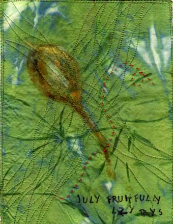
And to have a series to get me going. July in the midwest is full of lazy afternoons, spent in my hammock reading or bird watching, watching the summer progress in the garden. The buckeye leaves are still a lush green (buckeyes lose their leaves early), and the fruit are slowly swelling inside of velvety golden brown pods.


The background is hand dyed silk. Using Luminaire metallic paint, I loosely drew in the five leaflet leaves of the buckeye, overlapping as they do in reality. Then I decided I like the back side better, where there was more of the olive green showing and less of the metallic part. I fused the silk to a piece of felt to stabilize it, and then drew a seed pod on with Shiva paintsticks. Instead of waiting 24 hours as usual for the paintstick to dry, I went ahead and pressed it with a hot iron--and the strokes flowed together. Using a varigated green thread, I stitched curving lines across in two directions, entwining the lines where possible.

The words were stamped on; they say 'July fruitfully lazy days'. Kind of a summation about how I feel about the month.

The piece didn't feel quite done at this point. I had an elementary art teacher who claimed that all good pictures have a spot of red in the center. I don't believe that--now--although that probably accounts for the long vacation I took from making art, from about 10 to age 35. But I do like the excitement caused by opposing colors. Analagous schemes lure me, but those opposites just pop. So I took a piece of red pearle cotton and stitched a lazy running stitch across the top. Now it seems done.

This series continues to draw me in, give me a place to work when no ideas are coming. I am casting about for ideas for the next series, and wondering about the wisdom of having two series going at the same time--I do have an art fair and a solo show to get ready for. But now that I'm back in the studio, I'll stay there. Until the next distraction, the next hammock beckons.

6.06.2006

halfway point of the year of the buckeye

It's June, and the 6th piece of my 'year of the buckeye' series is done. Even as summer begins with a hot vengence, fall has also begun. Baby buckeyes are forming all over the tree, oblong globules of a umber-ochre color. And the leaves are out in full, going every which way, crossing over each other.

At the same time, I've been working on a small piece for my crit group based on a challenge called 'bits and pieces.' That piece is layer upon layer, encrusted, embellished, rich, heavy, over the top with details. Along with other exposures in my life lately (an abstract landscape oil painter, my garden), I wanted this piece to be at the other end of the spectrum--just using as little as possible to get my point across. I got close, but not close enough.

I started with polished cotton, which I painted with Setacolor paints. I placed an actual buckeye leaf on it, where it was are the light areas. Then I stitched lines inspired by the veins on a leaflet. Dashes cut out of scraps and pod shapes cut from hand dyed raw silk were fused on.

While the piece is simpler, calmer than my bits and pieces one, it still hasn't gotten down to the essence of what I was going for. But maybe that was because I didn't distill the thought into minimal words? Does the thought give birth to the art? Does thinking inspire art making? Is the scientist in me being too quiet or too noisy? How do I get to that place that some artists achieve, the place where one line connotes a world?

5.13.2006

May buckeye

May is the glorious month for the red buckeye in our yard. It is in full bloom, spectacular colors that pull off the red/green thing without looking the least bit Christmas-y. There are blooms on the end of every branch, big panicles of deep red tubular flowers. At the same time, the five lobed leaves have gotten almost full size, draping the branches and hiding the irregular shape of the tree.

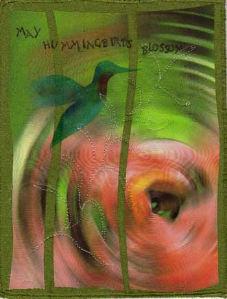
At the same time the hummingbirds have returned, and the red buckeye is perfectly tailored to attract them. I frequently see one feeding on one of the flowers--always too far away and too skittish to photograph, of course.

This piece started with a close up of one of the flower clusters. I fiddled with it in photoshop to abstract it, but capture the essence of looking at it--the red/green vibrations, the touches of other colors. The ripple effect proved best, maybe hinting at the blossom from the bird's point of view as he zeroes in on his target. The touch of yellow on the rim serves as a good highlight.

The bird is stenciled (hand cut stencil out of freezer paper) using shiva paintsticks, including some irridescent ones. The stitching mimics the feel of the long flower stalks, the freeness with which they sway in the May breezes.

Both the background and the printed piece are silk, which adds to the luster of the piece. Side by side with previous pieces, this one is noticably cheerier, brighter, greener. But so is the yard--gone are the neutrals of winter and early spring, the dominant color is now green, lush green, life reestablishing itself. May, one of the best months in the midwest.

4.10.2006

Buckeye in April

This has been a hard month to capture--it seems as if the buckeye is changing hourly. One morning last week I took pictures of the ready to burst open buds, by the afternoon they were changed...so I had trouble deciding which moment to choose.
I have a picture that I printed out on organdy, but it was too realistic even as I had abstracted it in photoshop. I'll make something of it, but not the April buckeye piece.
Instead I went more expressionistic--bud shaped fused pieces, freeform stitching, strokes of shiva, all reinforcing the idea of the buds busting out. The essence of spring.
The actual piece is a little less bright than this scan...I'm having trouble with the shininess of the silk background.

3.10.2006

March Buckeye

Spring is finally coming to the midwest, slowly but surely. The temperatures are milder, the grass is greening up, migratory birds have returned.
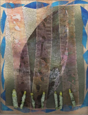
I decided that this month I wanted to use an actual photo of the buckeye as a basis for the piece. When I went outside to shoot it, I discovered the swelling buds were calling my camera. This closeup has been cropped and manipulated in Photoshop Elements, and printed on silk. I then fused it to a neutral piece that was slightly larger.
These scraps of sky blue were left over from the moon dance piece I talked about last time, and they make a good border--kind of like the sky peeking out with that intense blue we only get at this latitude in spring and fall.
I've been taking a course at Quilt University in using new, nontraditonal stuff. Through that I got entrapped the last few days with transparent ribbon--I'm trying to put it on everything. I used it as a binding on the knots piece (a dark blue that finishes the piece but lets the varigation in the fabric underneath show through), as a border on another piece. And now as strips across this piece. And as part of the beads.


Anyone who knows my art work well would tell you that I am fascinated by the effects of fire and heat on things. I frequently burn the edges of silk, and now I have added melted ribbon to the mix. The strips were first disperse dyed, then sewn in place. Then I melted them with a heat gun hovering over them. I then quilted the background, I wish I had done that before the strips were added, but these pieces are the equivalent of sketches--I learn from the doing, I don't redo them unless they really don't come out (hence the cutup earlier version of this picture currently residing in my stash of bits and pieces).
Wanting to add a dimensional touch, this morning I got the idea of trying to make rolled beads out of the ribbon. I rolled a short length around a wooden skewer, and added some small pieces of another sheer organdy on top. After pinning the ends in place, I went at it with the heat gun. It fused the layers together, and added texture at the same time. The base ribbon has a yellow edge on it, so when I was done the beads echoed the shape of buds on the buckeye.

March is a changeable time in the midwest, 60 one day, 30 the next. Grey one day, clear and windy the next. But it is a time when hope returns, when life returns. By next month the buckeye will probably be in full bloom, I'll be mowing, be outside without a coat. That will be good.

2.03.2006

February buckeye

Once again, I beat the month to the punch and started on my Feb. buckeye rendition in January. Lately I've been noticing that from a certain angle, the tree looks like a checkmark. This particular tree has not had an easy life, we've had to prune off some dead branches, and the result is a little lopsided. It will grow out of it, they always do. But I wanted to capture that simplistic single stroke that represents the way that tree looks at this time.


Ok, it's a checkmark with a stem. I picked out a piece of hand-dyed silk for some color in my life (it's been rather grey around here) and the texture in it. I decided to keep things simple and do the tree with a brush and Tsukineko ink. I started out with brown, and while it was still wet added some yellow to shade it a little. I went back in some places with more brown. Left to dry, some of the yellow blossomed out of the left hand branch--which kind of resembles how plants are trying to force the season with the warm days we've had recently.

I added some words (February The Hope Springs Forth if you can't quite read them) and some yellow rays of sunlight, and finished off the edges. It's probably done, it's just a journal piece, only 8x10 inches, and it says everything I want it to say.

I've been thinking a lot lately about the whole abstract/realism thing. I'm kind of put off by photorealism at the moment--why not just take a photograph? And I'm sure I don't quite understand the official definition and meaning of abstract art. But for me, what I'm doing is taking an inspiration from my microcosm, and capturing the essence of that in fiber by whatever means works. The question is, does the viewer understand that process without a long caption, and does that even matter? What my art is to me may or may not be what it is to the viewer. And I'm pretty sure I'm all right with that. While I make my art to sell, I also make it for me.

1.03.2006

journalling


Every year about this time I start thinking about making a journal of the year, a way to remember the highlights (and lowlights) of it. I am pretty good about keeping a written journal/sketchbook, but I'd like to do an art one, too.
One year I did a 4 inch square every day...that lasted about 9 months. I participated in the first QuiltArt Journal Pages, which was one a month. I even finished up that year.
But this year I was looking for something different. One of my favorite contemporary artists is Virginia Spiegel (www.virginiaspiegel.com). I was looking through her website the other day and saw a series she did of birch trees, one for each month of the year. So I stole that idea, except I am doing potraits of a red buckeye tree that lives outside my studio window. It's a quirky little thing, struggling to survive at the northern edge of its range. But hummingbirds love it when it's blooming, the buckeyes it get look improbably large for the size of the tree, and the leaves are heavily veined. So I'm going to study it for 2006.
Right now, of course, it is bare except for the occasional bird sitting on a branch. The worst part of winter in the midwest to me is the drabness, the absence of color.
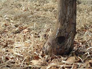
So I took a picture I have of winter grass. I opened Photoshop Elements, and took a long and narrow slice of just the grass. I widened the pixels to make the striped background (and rotated the slice). This I printed on some tablecloth linen. Then I fused the tree made out of discharged black cotton, added some stitching. Something was missing. The winter sun, which is pretty weak and not often seen around here. I made it out of painted misty fuse, and applied it. Then I did something new for me, I added words--January sun reclimbs the sky.
And a faint hint of a cardinal--one of the few colors I see daily--on a branch with a Shiva paintstick.
It's only January 3rd, and I'm already thinking of the February piece...I've thought about doing this weekly, but know myself too well to attempt that...