10.10.2006

October buckeye

Autumn is a time of big changes around here, although this year that's been hard to see sometimes. We've had record highs, chilly nights, clear blue skies, dreary grey days. Ok, a typical midwest fall.

The buckeye tree has compound leaves (technically that means that what you might perceive as leaves are actually leaflets on a leaf stalk; you can tell by looking for the bud for next year's leaf) As with most compound leaves around here, the leaflets fall off, leaving the bare stalks on the tree for a few days. In the case of a Kentucky coffee tree near the buckeye, the stalks are red and really stand out. The buckeye currently has yellow leaf stalks, no leaflets in sight unless you look on the ground, and a few pieces of open buckeye pods.

So this piece began with the inspiration of the clear deep blue skies and the leaf stalks and the curly, fuzzy seed pods. The basic background is a piece of old damask tablecloth that had been dyed with osage orange to an ochre color. Using masking tape stencils to mask out the leaf stalks, I painted the sky with Setacolor paints.

After that dried, I removed the masks and painted the stalks to give them some depth. Three pieces of a curled up pod were scanned and printed onto raw silk. I cut these out and fused them to the background. The quilting lines remind me of the floating and soaring of leaves in the autumn wind. The words 'October Breezes By' were stamped on the lower edge.


When I started this series in January, I was obsessed with the shape of the tree, and thought it would dominate this series. But the last few months I have been playing with the seed pods. I guess it goes to show that is one of the benefits of doing a series is that you don't know where it will take you. The series takes over to some degree. Of course, the next two months, leafless months, may cause the tree form to come back to my art. Wait and see.

10.04.2006

defining fiber

I find lately that my work has ceased being 'art quilts'. For one thing, it seldom has three layers, unless you count the layer of applique on top of the top layer...for another, it's starting to include fibers that aren't really fabric.

For instance, I'm working (although it feels like playing) on a piece that starts on a failed monotype on paper. Failed in the sense that it was a messy pull off the plate, and it just didn't work on its own. To it I've already added some silk and some metal foiling. After I had stitched across the paper--wonder if it dulls needles like it dulls scissors. Probably. But it's become a little piece of art.

My work does better in art shows than in quilt shows, maybe because I've strayed too far from quilt rules--I actually like uneven, big stitches. But that's ok with me I think.

I'm busy working on getting ready for a big solo show in February (in Jacksonville, Illinois, more details later), and I find the freedom of being able to frame or not frame a piece, to include an oddball material like window screening or twigs is a good thing.

So my definition of 'fiber art' is expanding. A picture of the first piece is below....percentage wise, it's around 10% fabric. But paper is fiber. So it's somewhere between fiber art and mixed media and the only time I have to define it is if I enter it in a show with categories.


9.10.2006

september buckeye

September has landed in Illinois with a dry, cool breeze and a bright blue sky. Of course, part of that is because we're in a drought. But leaves are starting to turn, and the buckeye pods are ripening. The leaves are starting to turn yellow and dry up.

And in looking back at the previous months, I thought it was time to capture the clusters of buckeyes. The pods are kind of elongated, almost pointy on the ends. The buckeyes inside are fairly round, but the pods aren't. One morning this week, they were capturing the sun on their fuzzy surface, and I saw what I wanted to depict.


I began with a piece of tablecloth linen that I had dyed using osage orange and some nails. Using Shiva paintsticks, I first drew on the shapes of the pods. Then I used a small stencil brush to smooth out the color and to add highlights and lowlights of other colors. I have found that unless I'm using stencils, I like drawing directly on the fabric first with the paintsticks. Probably it's my impatience, but just using stencil brushes seems to take too long to start seeing the look I want.

I stared at the impressionistic cluster of pods for a while. I thought I was going to stitch around them and add hints of leaves using thread only slightly different in color than the background. But when it came time to do it, there was black thread on my machine and I was compelled to try it out first. Liking what I saw, I continued (the piece was backed with a piece of felt by this point) doing the whole thing in black. I think the result looks like a pen and ink sketch.

The words are 'September Ripens', a reference to the setting in of fall. By October I fear all the leaves will be off this little tree, and the cold winds of winter will be heard faintly in the distance. The year has sped by, as usual, but the little line of these pieces on my design wall marks the time passage.

8.17.2006

disperse dyes

I've gotten some comments about disperse dyes. I have to admit that when I first tried them, it was part of my critique group's 'play days', and just seemed like yet another fiber toy that mostly distracted me rather than helped my art.

Part of that was, I now see, a fear of polyester. Coming from the traditional side of quilting, I had been indoctrinated with the mantra of 'natural fibers only'. In fact, 100% cotton only. A couple of years ago I branched out into silk, and haven't looked back. After all, the things I make are probably never going to be washed, aren't used to comfort sick children, why worry about what they're made of so much?

So I'm embracing other fibers. Even polyester, which does have its own advantages--you can seal the edges, the hand can be nice, some have a good sheen. And I like the look of disperse dyes.


This piece is 8"x6". The disperse dyes were painted onto a sheet of regular copy paper. I was going for a sunset scene, something to turn into a landscape. This was the first print (they do get a little lighter with each successive print), on a shiny white polyester about medium weight.
I had still more blue slash pieces (see my website if you don't know about the blue slash series) with steam-a-seam2 on them, and the color was right, so they found their way onto this piece. I backed it with a piece of felt and quilted both the diagonal stream lines on it (the piece is named 'Downstream'), and horizontal lines for variation.

But what I like most about disperse dyes is their ability to be subtle. I don't know of another way to achieve this with paint. Maybe you could do it with printing from a computer image. But each image is slightly different, and you can repeat if you need to. I'm working on a couple of other pieces where I have printed more than once on the fabric with the same sheet. I've also overprinted with different sheets.

My only complaint with disperse dyes is that the color on the paper isn't necessarily the color you see when it prints, particularly with the greens. But that can lead to happy accidents. Or a piece to save for another day.

They do not change the hand of the fabric any. I got mine from ProChem; I mixed up the powders several months ago and am still using them. They are getting a little weaker and may be almost ready to throw out. But the papers are good until you use them. And after all the prints have been made off them, they still could be used for collages or mixed media work.

So give them a try. ProChem has instructions on their site, it's the transfer printing method I think.

8.05.2006

the buckeye in August

The buckeye is one of the first trees in our yard to show signs of fall. The weather has been hot and dry lately, but it still is usual for the green to be disappearing from the buckeye by now--some leaves are completely yellow, others are starting to turn. The buckeyes continue to grow. By the time of the September piece, I expect the leaves to be falling off the tree.

So this month I wanted to celebrate the leaves yet again, while they're still in their shiny glory (the fall leaves are usually not very flashy on this tree). The background fabric this time is a polyester satin. I haven't usually used non-natural fibers, but then I discovered the process of transfers of disperse dyes. You paint the dyes onto sheets of paper (regular printer paper), let it dry. Then you can iron the design onto polyester fabric (it doesn't work on cotton or silk unless they have been painted first). The effect is more etherial than direct painting would be, and you can make multiple identical (although maybe fainter) prints--as I did on this piece, the tree shape was repeated.


It can be a little disconcerting to use the dyes, as the color they appear on the paper is not the color they print always. By the way, I got the dyes from ProChem.

The leaf shapes are cut from the same silk as the background fabric of the July block--dyed and painted. I fused them on, then quilted parallel lines diagonally over the surface. The words this month say 'August falls leaf by leaf.'

Autumn really starts quite early here, if you define autumn as involving seed ripening and plants dying back--the early spring bloomers are already gone. It's like a reminder of our own life cycle--the end is around the corner, we just don't know how far the corner is. But you have to stop and celebrate the moment, too. The moment when some leaves are still green, the fruit is still immature, the dry flies are rubbing their wings every night.

7.19.2006

travelling and inspirations

I'm on the road with my husband. A good excuse to play, or as some might call it, goof off. But I've been thinking a lot about my work, what to try next, what needs to be finished before my next art fair or show; but mostly about where I want to go with my art.

Sometimes I think I'm an artist in search of a medium. I'm most successful in fiber, but I keep richocheting to other media--watercolor, oils, paper collages, photography. Those attempts remain in the background, but I think they're influencing the fiber stuff.

So I present to you a photograph I played with in Photoshop Elements yesterday (ah, the joy of finally having a laptop to travel with...)


It began life as a picture of yellow crocuses against brown leaves. I can't wait to print it on silk and add some stitching to it. Or to try painting a big piece of fabric using this as a reference. Or making some felt with this as a starting point. Something tactile. When I get home.

7.06.2006

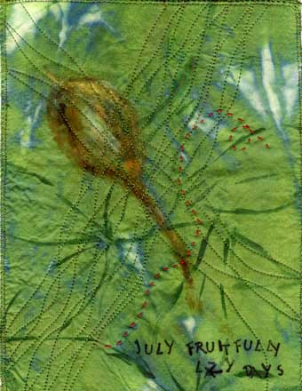
July and the buckeye

June was kind of a washout, art-wise. I spent much of the month getting ready to travel, travelling, and recovering from travel. I'm sure the experience will show up in future art, but it felt good to get back into the studio and just do the work today.

And to have a series to get me going. July in the midwest is full of lazy afternoons, spent in my hammock reading or bird watching, watching the summer progress in the garden. The buckeye leaves are still a lush green (buckeyes lose their leaves early), and the fruit are slowly swelling inside of velvety golden brown pods.


The background is hand dyed silk. Using Luminaire metallic paint, I loosely drew in the five leaflet leaves of the buckeye, overlapping as they do in reality. Then I decided I like the back side better, where there was more of the olive green showing and less of the metallic part. I fused the silk to a piece of felt to stabilize it, and then drew a seed pod on with Shiva paintsticks. Instead of waiting 24 hours as usual for the paintstick to dry, I went ahead and pressed it with a hot iron--and the strokes flowed together. Using a varigated green thread, I stitched curving lines across in two directions, entwining the lines where possible.

The words were stamped on; they say 'July fruitfully lazy days'. Kind of a summation about how I feel about the month.

The piece didn't feel quite done at this point. I had an elementary art teacher who claimed that all good pictures have a spot of red in the center. I don't believe that--now--although that probably accounts for the long vacation I took from making art, from about 10 to age 35. But I do like the excitement caused by opposing colors. Analagous schemes lure me, but those opposites just pop. So I took a piece of red pearle cotton and stitched a lazy running stitch across the top. Now it seems done.

This series continues to draw me in, give me a place to work when no ideas are coming. I am casting about for ideas for the next series, and wondering about the wisdom of having two series going at the same time--I do have an art fair and a solo show to get ready for. But now that I'm back in the studio, I'll stay there. Until the next distraction, the next hammock beckons.