1.30.2006

silken knots

Coming from a traditional quilt background, when I first started making art quilts, I was firmly stuck in the 100% cotton rut. It had to be all natural or nothing.

Then I saw some pieces by Annie Helmericks-Louder, large wall hangings made of silk. Knocked my socks off--the sheen, the colors, the texture. So I started playing with silk. Made some pieces that were all silk, some that were various types of silk combined (raw, crepe).

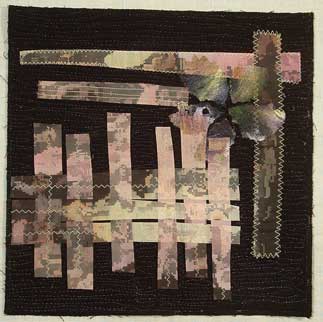
I've been playing with some hand dyed pieces of cotton, ones that were put in more than one dye bath so there's a lot going on in them. I took this one piece and put some narrow tucks across it to increase the texture. For some reason, I had a scrap of green silk laying on my work table. I picked it up, tied some knots in it, and one thing led to another and led to this piece:


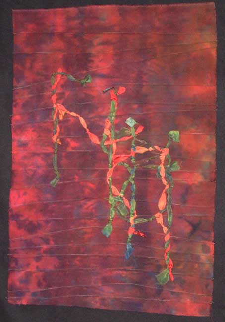
I'm not sure the difference in sheen shows up in the picture, but in person it's very striking. And the strips of knotted silk pop off the surface here and there. I couched down the strips, even the ones that are woven in an out of the others. The piece is currently backed with a piece of felt and the edges are raw, I may finish off the edges somehow...and I haven't decided whether it will be framed or freehanging...

1.12.2006

printing my own fabric

I have a closet full of commercial fabric. I don't use it very oftern. First I became enchanted by hand dyeing and discharging, and then I started printing photos on fabric.

I've been an amateur photographer for a long time. But there wasn't much to do with the pictures except admire them privately. Most weren't good enough to show as art. But then I got Photoshop Elements, and the fun began.

This series is a good example of what I've done. They are all taken from the same photo, a closeup of decaying magnolia blossoms. I lightened the color, added some artistic effects, and printed multiple copies.

This first one was printed on cotton organdy.The copies were rotated and then the one in the middle is applied so that it sticks out some.

The next was the result of printing out like 20 pieces about 1x1 inches apiece. The result harks back to traditional quilt settings. The background is raw silk.

This last one is the rescued result of trying to print too big--the picture pixelated, and the overall picture looked crummy. But cut into pieces, the result was better. I added painted webbing in the shape of a flower.


I use an Epson CX6400 with durabright pigment inks. To feed the fabric through the printer, I adhere it to full sheet adhesive labels (I can't get freezer paper to work for me, these are reusable if you're careful about taking the fabric off). As a result of only being able to print on 8.5x11 fabric, my work has gotten smaller. But I frame these pieces, and people say they like them.

1.07.2006

playing around

I've been playing around with scraps and bits and pieces, making postcards to donate to Virginia Spiegel's fiberart for a cause project (www.virginiaspiegel.com). It's an excellent cause (all proceeds go to the American Cancer Society) and also gives one the freedom to try new things.
Anyway, I had a page I had printed out of a flower picture I had manipulated in Photoshop Elements. The flower is a native prairie plant, Monarda, also known as bee balm. On my monitor, the manipulations had looked great. But it printed out way to dark. It hung on my design wall for weeks. When I was getting ready to play, I decided to sacrifice it for the cause.

Both of these pieces came from that original 8x10 print. I had heard about using Shiva paintsticks to do rubbings, so I got out this stamp I had carved.


The original stamp design was inspired by my friend's pond. In the summer time, it gets covered with duckweed. He has a paddlewheel boat, and one day some kids were paddling it around in circles. Their wake caused these swirls and ripples in the duckweed. I took the picture and transferred it to the rubber, then carved it out. It's a nice random but organic pattern.
I stretched the monarda picture over the block and rubbed on it with two colors of irridescent Shiva paintsticks--gold and copper. By varying the pressure, I was able to vary the pattern.
Next I cut them close to size. I wasn't quite satisfied, they were a little blah. I got out some fabric paints, wet them down to blur the edges, and started adding color. The top one got mostly black, the bottom one purple and yellow. The Shivas turned out to be a resist, which added to the resulting texture.
Finally I added some random stitching, painted fusing, the words 'bee balm' on one. I finished them up by layering them with Timtex and a back, and finished off the edges with a finishing stitch on my machine.
Not bad for scraps.

1.05.2006

aurora revisited

Well, I just matted and framed the aurora piece as is. It looks great, I must say. Now all I have to do is dither about why it took me so long to just do this.

BTW, as of Monday it will be hanging at the Great River Watercolor Society show at the Grey Gallery, Quincy University, Quincy, Illinois for the month of January.

Sometimes I just need to do it--I try to live by the artistic Dorito's principle--use it, they'll make more. But sometimes I get caught up in a search for perfection, which I'll never reach anyway. Other times I'm pretty ruthless and will cut up anything in sight if it's the right color or texture. And my inner critic thinks those pieces are the better ones...

1.03.2006

journalling


Every year about this time I start thinking about making a journal of the year, a way to remember the highlights (and lowlights) of it. I am pretty good about keeping a written journal/sketchbook, but I'd like to do an art one, too.
One year I did a 4 inch square every day...that lasted about 9 months. I participated in the first QuiltArt Journal Pages, which was one a month. I even finished up that year.
But this year I was looking for something different. One of my favorite contemporary artists is Virginia Spiegel (www.virginiaspiegel.com). I was looking through her website the other day and saw a series she did of birch trees, one for each month of the year. So I stole that idea, except I am doing potraits of a red buckeye tree that lives outside my studio window. It's a quirky little thing, struggling to survive at the northern edge of its range. But hummingbirds love it when it's blooming, the buckeyes it get look improbably large for the size of the tree, and the leaves are heavily veined. So I'm going to study it for 2006.
Right now, of course, it is bare except for the occasional bird sitting on a branch. The worst part of winter in the midwest to me is the drabness, the absence of color.
So I took a picture I have of winter grass. I opened Photoshop Elements, and took a long and narrow slice of just the grass. I widened the pixels to make the striped background (and rotated the slice). This I printed on some tablecloth linen. Then I fused the tree made out of discharged black cotton, added some stitching. Something was missing. The winter sun, which is pretty weak and not often seen around here. I made it out of painted misty fuse, and applied it. Then I did something new for me, I added words--January sun reclimbs the sky.
And a faint hint of a cardinal--one of the few colors I see daily--on a branch with a Shiva paintstick.
It's only January 3rd, and I'm already thinking of the February piece...I've thought about doing this weekly, but know myself too well to attempt that...