I'm working on a big piece, well big for me. It's around 3 foot by 4 foot. The working title is 'Dancing in the Light of the Moon', subject to change. This piece has done a lot of its own decision making, veering off into directions I never intended. For instance, the background fabrics started out as an attempt to replicate the rolling hills and fields around the river here. That's a little hard to see now as it wanted to be dyed fairly dark.
Anyway, it's time to quilt it. I want to convey more of the dance feeling, and my first thoughts were of adding a Kokopelli. I can see him playing the flute in the bottom left corner, some little moonlight sonata, enjoying the moment.
But then I became obcessed with the thought that Kokopelli is too overdone as a symbol, has become a cliche, some kind of southwest joke figure. Do we have the right to claim anything as a symbol in our artistic lives, or are we limited to things that come from our personal past, our personal culture? Is living in the same country that Kokopelli's inventors lived enough? Does using him step over the line of trendiness, becoming trite in the process?
And if I invent my own symbol, what does it convey if no one knows the background of that symbol? I use the kayak as a symbol in a lot of my work, but it's never a very realistic kayak, and only occasionally does it become instantly identifiable as a kayak. And does the viewer think the same thing as I do when they think 'kayak'? I think of floating down the river, leaning back and staring at a rising full moon, my hand trailing in the water. It's a peaceful symbol to me. But if someone else is a whitewater kayaker, I can see that the symbol would be entirely different.
Maybe I just overthink these things. Maybe I should get back to the mind space where the quilt would tell me what to do. Maybe this is part of, a continuation of, the doritos principle--do it, I can make another one...
2.22.2006
2.15.2006
the abstraction continues
My fiber pieces continue to evolve. I now find it nearly impossible to do realism in either fiber or my other medium, watercolor. I just don't see the point of doing something that could be duplicated, or improved, by capturing with a camera. And they become less refined--it's more about the texture than the properness.
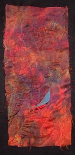
Take this piece for an example. I was experimenting with putting different types of silk together, and then dyeing them so that the color was independent of the sheen. For some reason, I liked it with the seams showing when it was done--something that wouldn't have occurred to me a couple of years ago. Silk is a bugger to deal with, and the quilting of it (carelessly I admit) left some puckers here and there--but I like them. The raw edges are fraying and exciting.
But the orange needed something. I first added the curved blue piece, but that wasn't quite enough. Up close you can see that I kind of replicated the shape, although enlarged and more freeform, in blue stitching above the actual blue piece of silk. Overall, the piece began to come together.
One of my mentors in art told me that art should look good from three distances--something like 20 feet, 3 feet, and 1 foot. For the 1 foot part of this, before quilting, I used the Shiva paintsticks again, rubbed over the same rubber stamp I talked about in an earlier post. The marks are subtle, but they add to the surface interest.
Now about the abstraction. So far I haven't mentioned the name of this piece, because it will reveal part of what I was thinking about--it's called 'blue bird'. Before that, has you recognized the swatch of blue as a bird shape? Does the name influence your view of the piece? I can't separate the two when looking at it, but then I created it so I find it hard to be totally objective.
And that lack of objectivity is part of my view of abstraction--I can't separate my inspiration from the piece, no matter if the inspiration is foremost in my brain as I begin a piece, or if it only reveals itself as the piece progresses. Does that matter? Probably not. But the process of coming from realism to abstraction has made me look at other abstract art with a different eye--the education of doing rather than just looking.
2.03.2006
February buckeye
Once again, I beat the month to the punch and started on my Feb. buckeye rendition in January. Lately I've been noticing that from a certain angle, the tree looks like a checkmark. This particular tree has not had an easy life, we've had to prune off some dead branches, and the result is a little lopsided. It will grow out of it, they always do. But I wanted to capture that simplistic single stroke that represents the way that tree looks at this time.
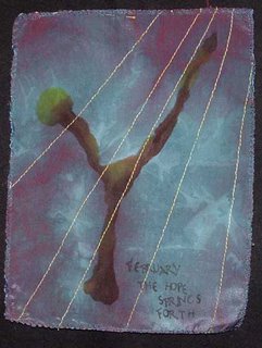
Ok, it's a checkmark with a stem. I picked out a piece of hand-dyed silk for some color in my life (it's been rather grey around here) and the texture in it. I decided to keep things simple and do the tree with a brush and Tsukineko ink. I started out with brown, and while it was still wet added some yellow to shade it a little. I went back in some places with more brown. Left to dry, some of the yellow blossomed out of the left hand branch--which kind of resembles how plants are trying to force the season with the warm days we've had recently.
I added some words (February The Hope Springs Forth if you can't quite read them) and some yellow rays of sunlight, and finished off the edges. It's probably done, it's just a journal piece, only 8x10 inches, and it says everything I want it to say.
I've been thinking a lot lately about the whole abstract/realism thing. I'm kind of put off by photorealism at the moment--why not just take a photograph? And I'm sure I don't quite understand the official definition and meaning of abstract art. But for me, what I'm doing is taking an inspiration from my microcosm, and capturing the essence of that in fiber by whatever means works. The question is, does the viewer understand that process without a long caption, and does that even matter? What my art is to me may or may not be what it is to the viewer. And I'm pretty sure I'm all right with that. While I make my art to sell, I also make it for me.
Subscribe to:
Comments (Atom)


