5.13.2006

May buckeye

May is the glorious month for the red buckeye in our yard. It is in full bloom, spectacular colors that pull off the red/green thing without looking the least bit Christmas-y. There are blooms on the end of every branch, big panicles of deep red tubular flowers. At the same time, the five lobed leaves have gotten almost full size, draping the branches and hiding the irregular shape of the tree.

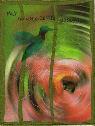
At the same time the hummingbirds have returned, and the red buckeye is perfectly tailored to attract them. I frequently see one feeding on one of the flowers--always too far away and too skittish to photograph, of course.

This piece started with a close up of one of the flower clusters. I fiddled with it in photoshop to abstract it, but capture the essence of looking at it--the red/green vibrations, the touches of other colors. The ripple effect proved best, maybe hinting at the blossom from the bird's point of view as he zeroes in on his target. The touch of yellow on the rim serves as a good highlight.

The bird is stenciled (hand cut stencil out of freezer paper) using shiva paintsticks, including some irridescent ones. The stitching mimics the feel of the long flower stalks, the freeness with which they sway in the May breezes.

Both the background and the printed piece are silk, which adds to the luster of the piece. Side by side with previous pieces, this one is noticably cheerier, brighter, greener. But so is the yard--gone are the neutrals of winter and early spring, the dominant color is now green, lush green, life reestablishing itself. May, one of the best months in the midwest.

5.03.2006

the year of the robin

Robins have been in my life in a big way this year...lots of them around all winter, encounters with them in the snow, and now a nest with four little ones on my patio. It seems appropriate to mark 2006 (even though we are only 1/3 of the way through it) as the Year of the Robin. And to commemorate it with art.

The problem, as usual, is how to achieve that. The idea has been rolling around in my brain for weeks, encounters lodging themselves in my memory. My work in general has been getting more abstract lately, but most of the visions I see for this piece take a step backwards from that.


This quick sketch was done with shiva paintsticks on a suede-like polyester fabric. I drew directly on the fabric, and then softened it with mineral spirits (the only solvent I had in the house that would work). Then I stitched some on it with varigated thread. It's a start.

I keep thinking of some pieces of western art I saw on Antiques Roadshow. I think they were done by a native American artist, and were kind of petroglyph-like. Just outlines mostly, with some color filled in here and there. A kind of narrative moving across the piece.

So I could start in a corner of a piece of fabric and add things as they happen this year--but I'm torn between just drawing them with paintsticks or ink, and stitching them...

Which brings up yet another dilemna working away in my brain. Lately I've just been backing my pieces with acrylic felt, so they are only two layers. Less finishing to deal with, flatter, less heavy. So they are no longer really 'quilts'. Do I care? Not much, but it makes the piece harder to define on a show submission...maybe I just don't have enough real life problems to worry about, huh?

The year of the robin will probably end up being a personal enough piece that it will never be for sale anyway. So what do I have to lose, right?

4.10.2006

Buckeye in April

This has been a hard month to capture--it seems as if the buckeye is changing hourly. One morning last week I took pictures of the ready to burst open buds, by the afternoon they were changed...so I had trouble deciding which moment to choose.
I have a picture that I printed out on organdy, but it was too realistic even as I had abstracted it in photoshop. I'll make something of it, but not the April buckeye piece.
Instead I went more expressionistic--bud shaped fused pieces, freeform stitching, strokes of shiva, all reinforcing the idea of the buds busting out. The essence of spring.
The actual piece is a little less bright than this scan...I'm having trouble with the shininess of the silk background.

3.30.2006

inspiration where you find it

Yesterday I had the chance to watch a great documentary, called 'Rivers and Tides'. It's about a Scottish sculptor named Andy Goldsworthy and the creativity exercises he does. He goes outside and makes art with natural objects, sometimes deliberately placing them where they will be destroyed when the tide comes in, or the wind comes up. He makes beautiful, if temporary pieces this way. Rent the movie and watch it.

Today is one of the first warm spring days here in Illinois, so I took a walk and tried it. This piece was made by gathering oak bark and twigs in a small area, and laying them out ala a log cabin. I made three pieces in all, the biggest around 12" square. It's a very freeing exercise to stimulate creativity--because I knew it probably wouldn't be there tomorrow, and because all the supplies were free, I just played. It would be very easy to enter a meditative state doing this. Try it.

The other thing I have been doing on my walks is taking pictures of the cold patches on the asphalt--for some reason I keep seeing one of my personal symbols, the kayak, on the road...haven't figured out what to do with them, but they're cool I think.

3.24.2006

Dance of the Blue Slash

Sometimes I intentionally work in series, exploring a certain idea, exploiting the same inspiration. Sometimes I find a series when I'm two or three pieces into it, when I lay the pieces side by side and realize the connection. Sometimes I've forced things into a series for expediency, as in the planning for my website (soon to be coming to a cyberspace near you). And sometimes the series just explode into my studio, linking the pieces together with some kind of synergy springing from my artistic brain, bypassing my scientific brain.

The Dance of the Blue Slash series is a prime example of the last kind. It began on the kokopelli quilt I discussed before, where the unfinished piece needed some bright blue pieces. I dyed a piece of silk the right color, and fused part of it. I cut off the pieces I needed, and they worked. But I had cut more than I needed, and so there were extras laying on the chest right beside my design wall.

So the March buckeye piece came along, and needed a border. The blue slashes jumped over and formed the border.

Next came an abstract view of the hills around me in their winter dullness...it needed the blue, too, five tiny pieces on the surface, floating in the space between the hills.

Fourthly, there was a piece of silk I had painted abstractly from a memory of the wooded riverbank in late fall--greys, rusts, some blues and a touch of yellow here and there. Although I had added some texture to the piece by pleating it, the piece was unfinished. Until the blue slashes said, hey, make us long and skinny and we'll fit between the pleats and spark the piece up. They do. I currently am trying to fight the fact that this piece would like to be in a windsock shape with a light inside of it--being silk, it glows...the mechanics of that are still giving me pause.

And fifthly, there was a small practice piece that has been kicking around for months. It is a prime example of more is more, having every technique I've been using lately on it almost. But it wasn't quite right, not finished. The small blue slashes danced on to it, and found a home. The piece is now quilted and ready to mat. The edges are uneven and ravelling, but I like it now.

3.10.2006

March Buckeye

Spring is finally coming to the midwest, slowly but surely. The temperatures are milder, the grass is greening up, migratory birds have returned.
I decided that this month I wanted to use an actual photo of the buckeye as a basis for the piece. When I went outside to shoot it, I discovered the swelling buds were calling my camera. This closeup has been cropped and manipulated in Photoshop Elements, and printed on silk. I then fused it to a neutral piece that was slightly larger.
These scraps of sky blue were left over from the moon dance piece I talked about last time, and they make a good border--kind of like the sky peeking out with that intense blue we only get at this latitude in spring and fall.
I've been taking a course at Quilt University in using new, nontraditonal stuff. Through that I got entrapped the last few days with transparent ribbon--I'm trying to put it on everything. I used it as a binding on the knots piece (a dark blue that finishes the piece but lets the varigation in the fabric underneath show through), as a border on another piece. And now as strips across this piece. And as part of the beads.


Anyone who knows my art work well would tell you that I am fascinated by the effects of fire and heat on things. I frequently burn the edges of silk, and now I have added melted ribbon to the mix. The strips were first disperse dyed, then sewn in place. Then I melted them with a heat gun hovering over them. I then quilted the background, I wish I had done that before the strips were added, but these pieces are the equivalent of sketches--I learn from the doing, I don't redo them unless they really don't come out (hence the cutup earlier version of this picture currently residing in my stash of bits and pieces).
Wanting to add a dimensional touch, this morning I got the idea of trying to make rolled beads out of the ribbon. I rolled a short length around a wooden skewer, and added some small pieces of another sheer organdy on top. After pinning the ends in place, I went at it with the heat gun. It fused the layers together, and added texture at the same time. The base ribbon has a yellow edge on it, so when I was done the beads echoed the shape of buds on the buckeye.

March is a changeable time in the midwest, 60 one day, 30 the next. Grey one day, clear and windy the next. But it is a time when hope returns, when life returns. By next month the buckeye will probably be in full bloom, I'll be mowing, be outside without a coat. That will be good.

2.22.2006

symbols as cliche

I'm working on a big piece, well big for me. It's around 3 foot by 4 foot. The working title is 'Dancing in the Light of the Moon', subject to change. This piece has done a lot of its own decision making, veering off into directions I never intended. For instance, the background fabrics started out as an attempt to replicate the rolling hills and fields around the river here. That's a little hard to see now as it wanted to be dyed fairly dark.

Anyway, it's time to quilt it. I want to convey more of the dance feeling, and my first thoughts were of adding a Kokopelli. I can see him playing the flute in the bottom left corner, some little moonlight sonata, enjoying the moment.

But then I became obcessed with the thought that Kokopelli is too overdone as a symbol, has become a cliche, some kind of southwest joke figure. Do we have the right to claim anything as a symbol in our artistic lives, or are we limited to things that come from our personal past, our personal culture? Is living in the same country that Kokopelli's inventors lived enough? Does using him step over the line of trendiness, becoming trite in the process?

And if I invent my own symbol, what does it convey if no one knows the background of that symbol? I use the kayak as a symbol in a lot of my work, but it's never a very realistic kayak, and only occasionally does it become instantly identifiable as a kayak. And does the viewer think the same thing as I do when they think 'kayak'? I think of floating down the river, leaning back and staring at a rising full moon, my hand trailing in the water. It's a peaceful symbol to me. But if someone else is a whitewater kayaker, I can see that the symbol would be entirely different.

Maybe I just overthink these things. Maybe I should get back to the mind space where the quilt would tell me what to do. Maybe this is part of, a continuation of, the doritos principle--do it, I can make another one...